Holiday Gift Guide
When:
Winter 2021
Client:
GK Elite
Programs:
Adobe Photoshop, Zmags, Listrak
Description:
During the holiday season, retailers want to maximize the gift buying experience for their customers. A popular way to achieve this goal is to create an easy comprehensive list, or guide of items broken into various categories to help find their ideal consumer. Not only do companies create this gift guide, but then they also have to let people know it’s available! The following touchpoints all help to achieve these goals.
A note, we understood the importance of creative a cohesive look and feel for this campaign, that way when a user discovers one touchpoint, they can identify other touch points as well. It should also feel cohesive in the GK ecosystem, reinforcing our already existing GK Holiday 2021 collection, but adding its own Gift Guide flair.
Landing Page
Here, we created an easy guide for customers to find gifts for the gymnasts in their life. I was given the various lists and categories and designed the layout for easy clicking. The goal, of course is to keep people on the page and exploring their options, finding that perfect gift, and proceeding to the purchase.
This was the first asset designed for this campaign. We went for a wrapping paper and pattern branding so that it reinforces the gift guide message to consumers. Then I pulled the colors and gold accents from the Holiday 21 catalog to create a cohesive message.
The overall page is quite long, so I will pull a few of the sections that performed the best.
View:
Please note that the gift guide landing page may change throughout the year based on marketing efforts. At the time of this portfolio being live it still lives there, but may change. Please refer to the screenshots included to accurately follow along with my captions.
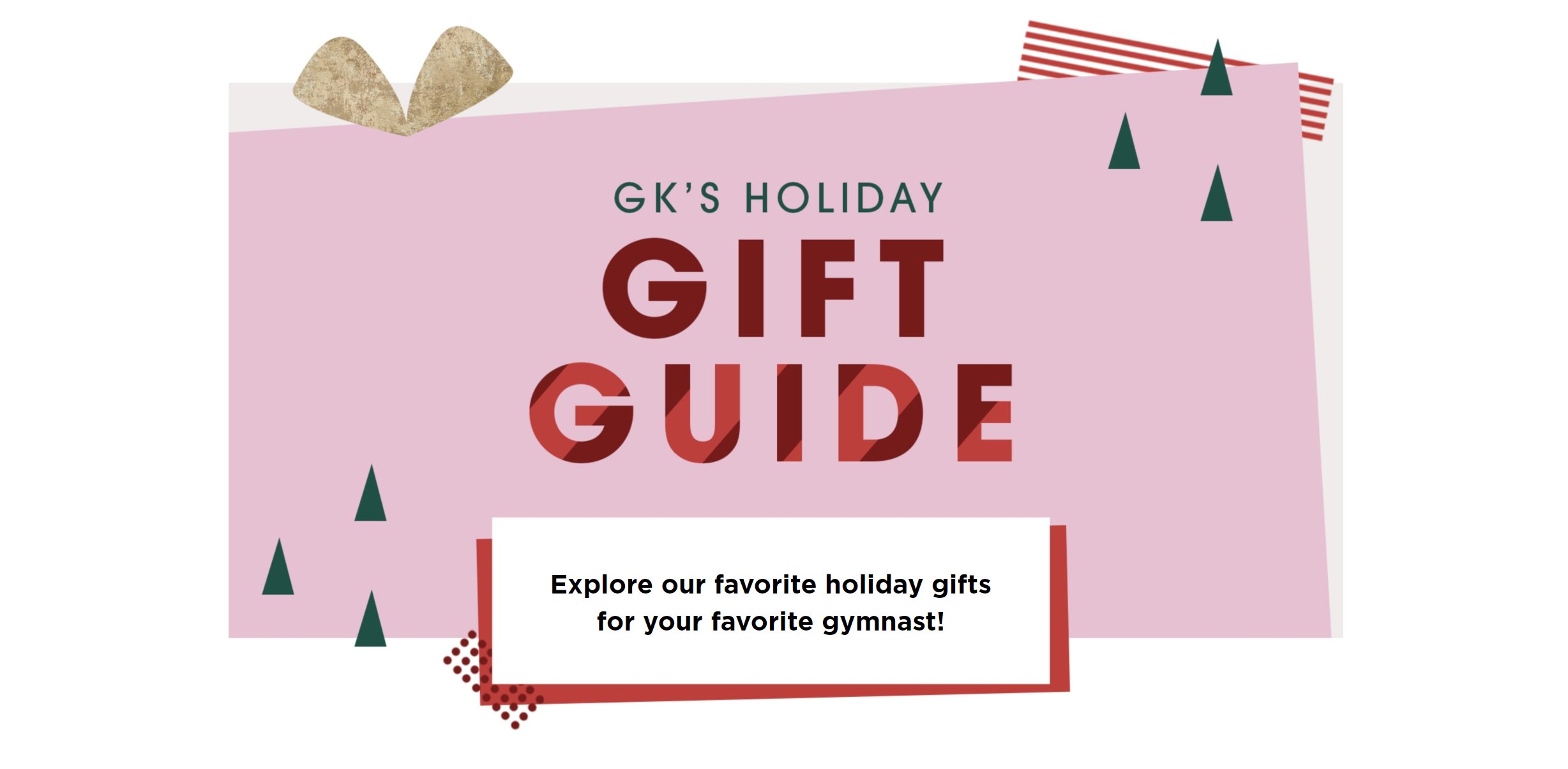
This section became the most important area for continuity between the various touch points in the project. The consistent solid pink gift background was important to establish the brand and ADA compliancy with the darker colors for text.
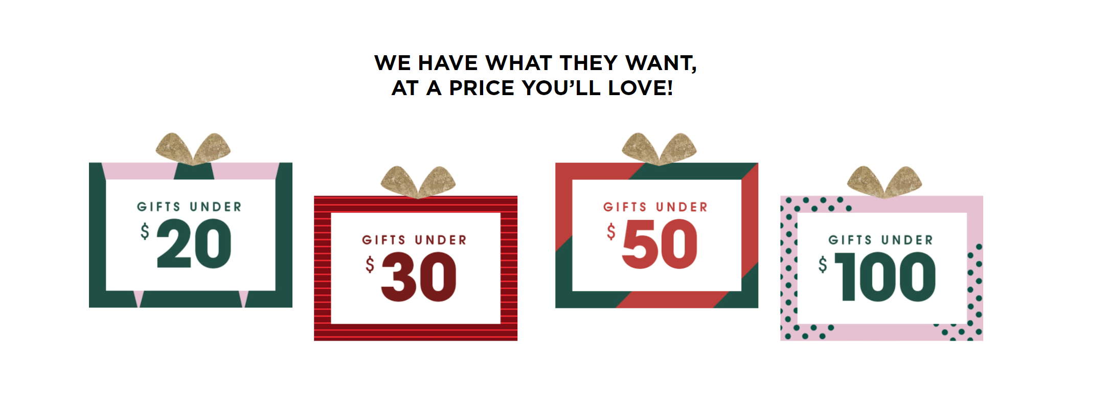
The price buckets were the most popular category according to the stats from 2020, there we kept these buttons at the top of the page for easy access. They also establish the various other patterns used throughout the campaign.
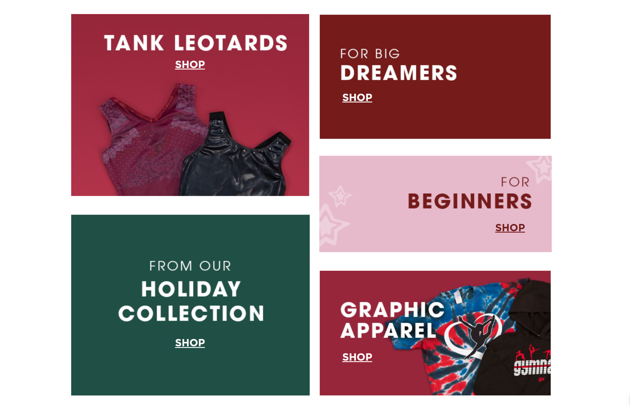
It is important to note that in this section I wanted to keep in mind mobile integration. I tried to design the page in a way to make the experience equal between mobile and desktop users. Also, as a bonus, desigining with mobility in mind make the building process in our landing page creator, Zmags, much easier!
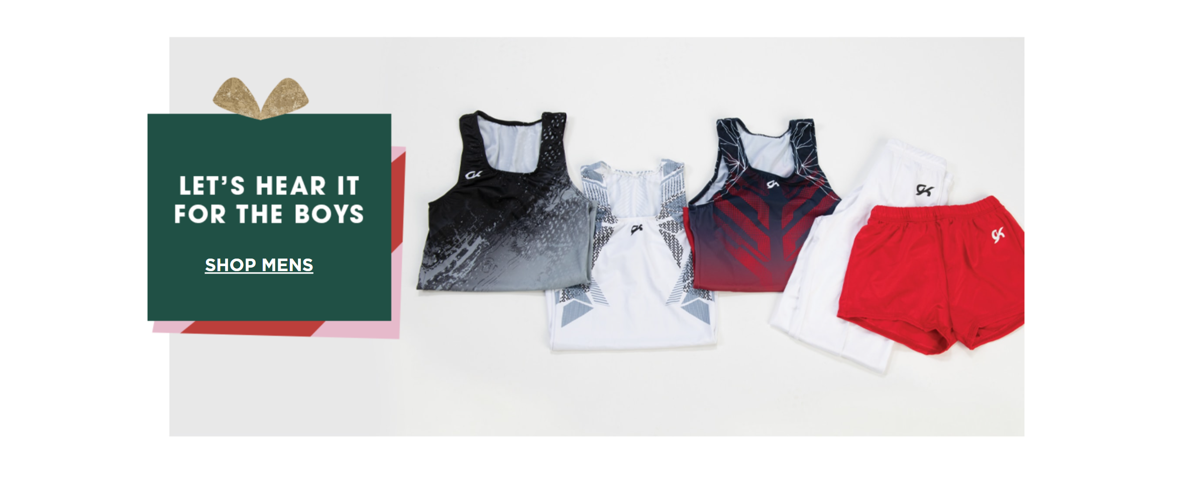
Another example of how the elements and laydown imagery that was captured married together to create a cohesive experience.

Though this section wasn’t featuring a product or category, it was a nice reminder for the consumer to reach a certain amount in their cart to qualify for free shipping. The seamless integration of the branding and colors afforded immersion in the experience and a smooth shopping experience.
Email Communications
Though it is good to have the gift guide live on the website, it is important to get the message out to let people know it’s available to explore! That is where we try to spread the word out through multiple channels
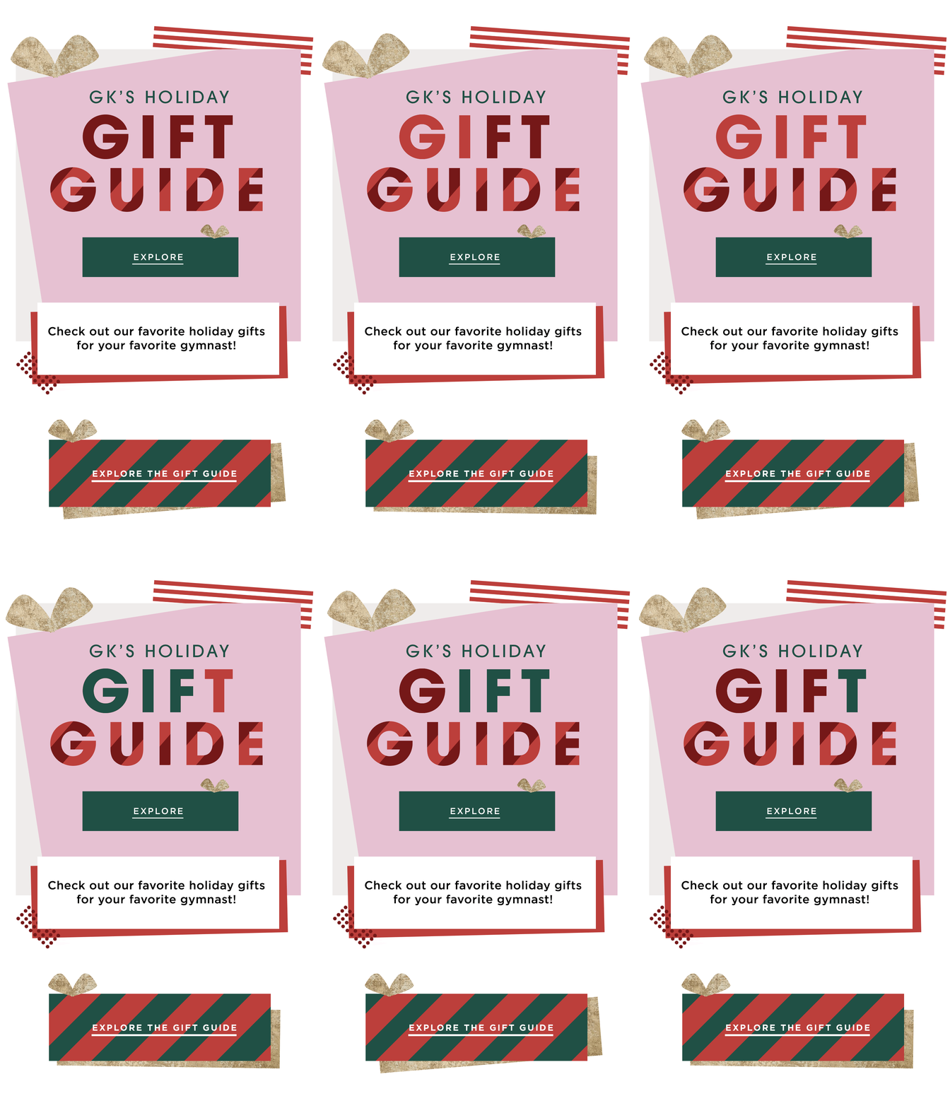
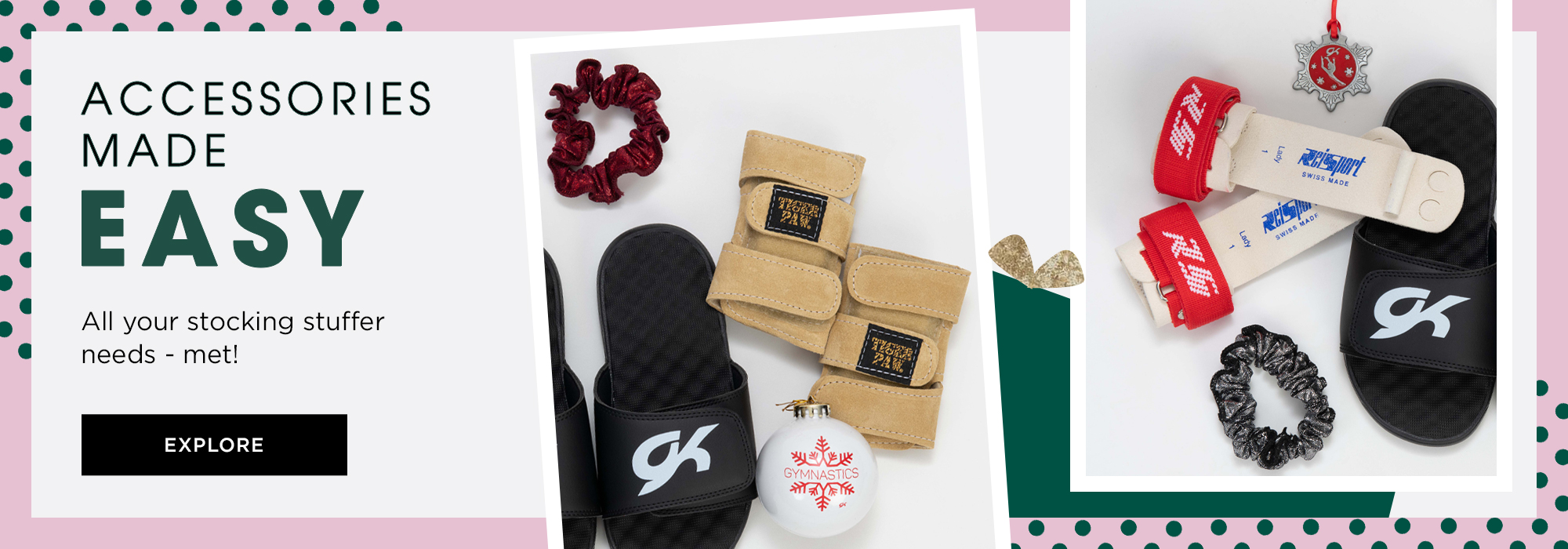
Here is another email communication we sent out during the lifetime of the Gift Guide. The theme centered around accessories and stocking stuffers. Here we created opportunities for consumer to click through to direct product, all accessories to browse, or the whole gift guide to explore further.
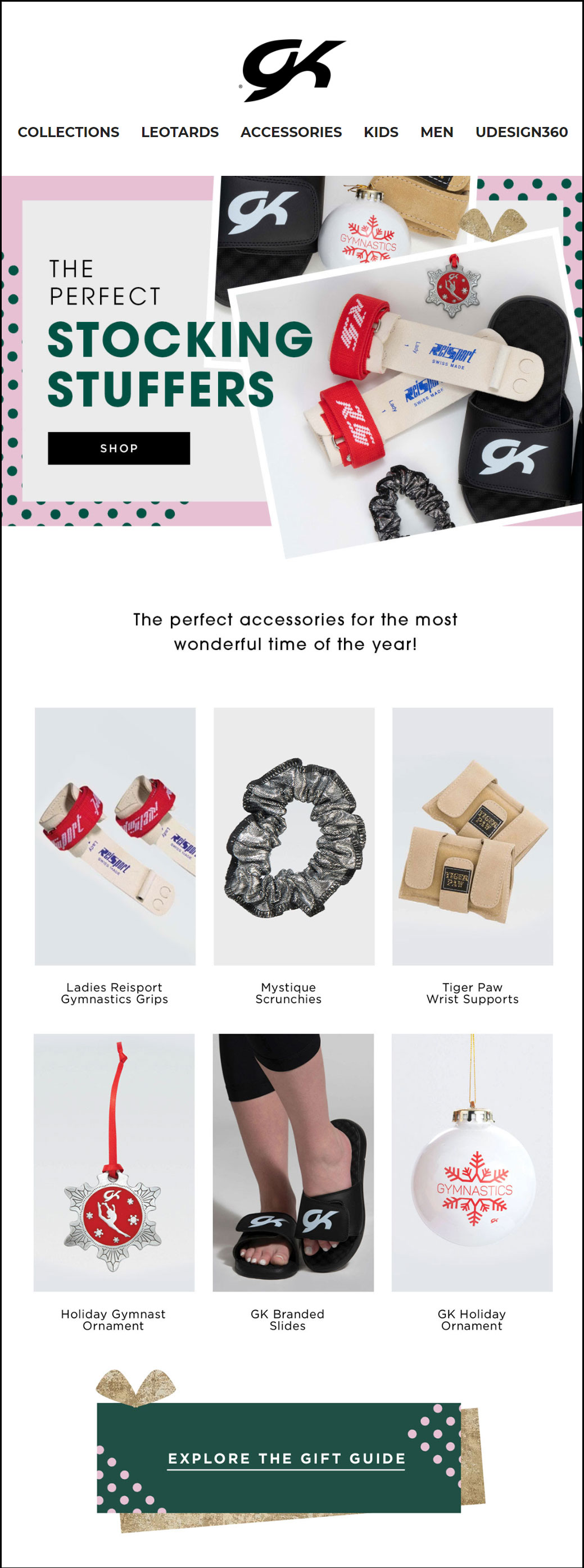
Homepage Banners
Here, if someone were already to be on the website, we tried to place various links through the site to lead traffic to the gift guide. Included are featured homepage banners and collection banners.
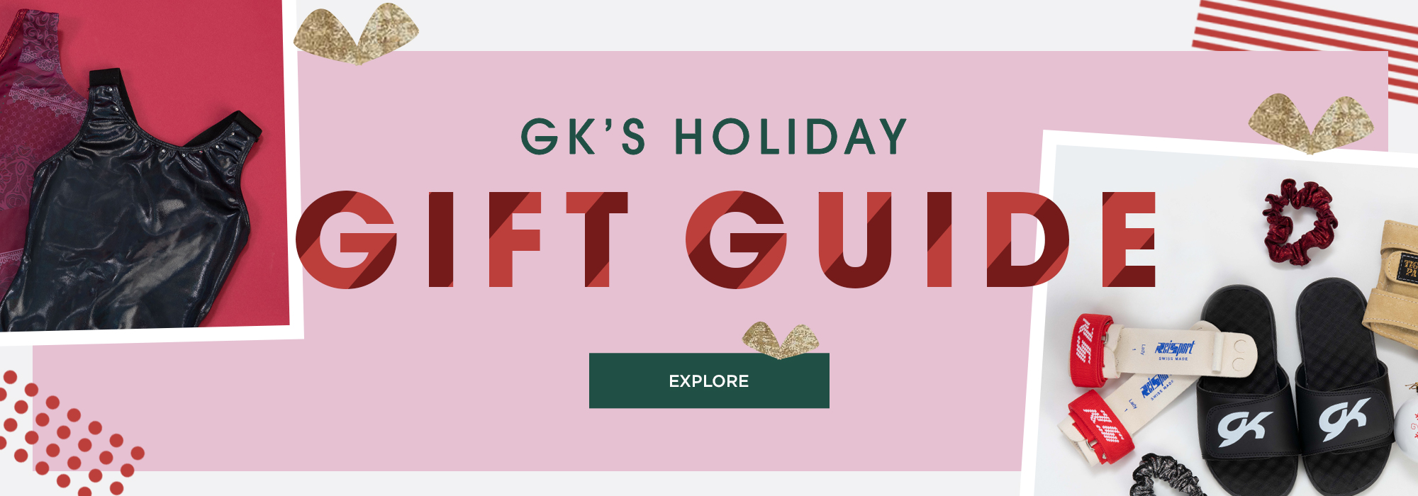
And here's another example for banner that we used throughout the campaign, with the matching email correspondence from above.
Social Graphics
And last, but certainly not least, comes the social channel communications. Again, we supplied links through the Instagram page bio and through stories to make this experience accessible in as many ways as possible.
